Groovy
Brand strategy, identity, design, creative, packaging
GOAL
To rebrand a chain of specialty coffee shops.
SOLUTION
To form an up-to-date brand strategy that will enable the coffee shops chain to expand its audience and to relevantly express this strategy in an identity.
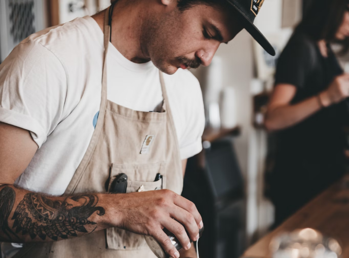
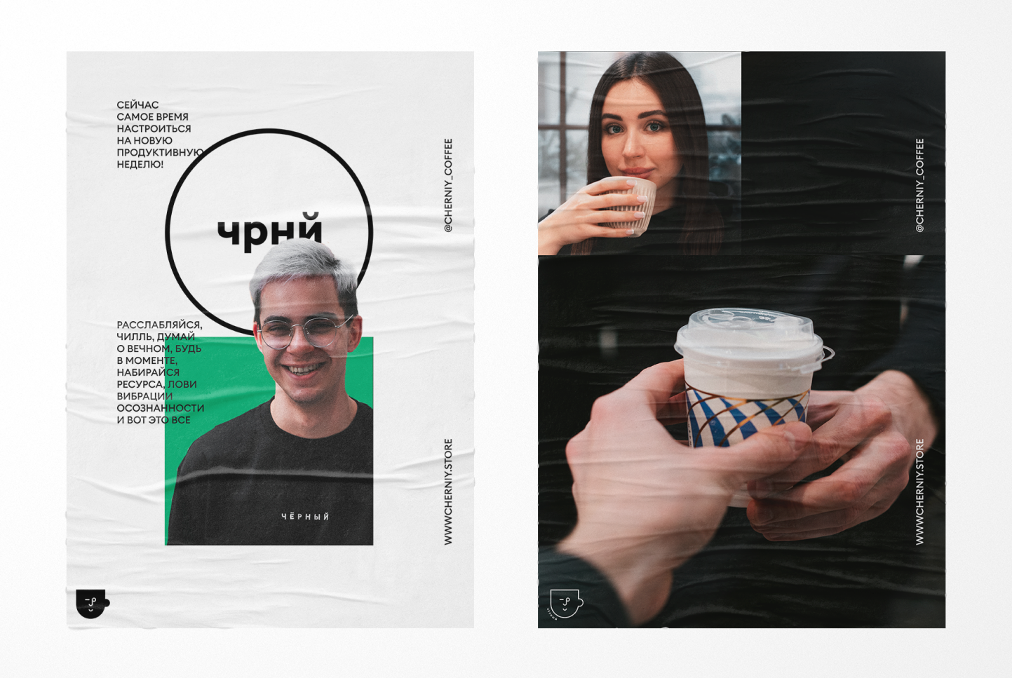
The personality of the barista is extremely important in the specialty segment, therefore, as part of the brand strategy, the path of even greater “humanization” of the service was chosen.
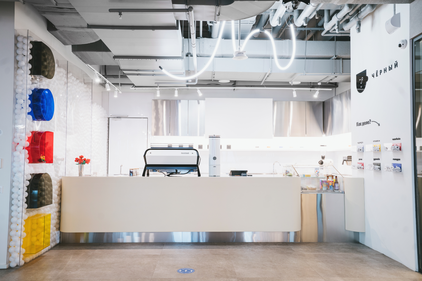
“Brewing in a coffee theme” is a new message that intertwines the professionalism of a barista with his hobbies. They are reflected in the design of coffee shops and create a lamp atmosphere for customers who have embarked on the "Black" path.
Coffee is a cosmopolitan product. It unites people with different worldviews and hobbies. This idea backs up the concept of the Groovy brand of specialty coffee shops. Initially, these shops were located in large business centers and offices of IT companies. These are power places that the most intellectually advanced individuals gravitate towards. Because of their wealth of accumulated experience, such people place high demands even on coffee.
Once the founders of the brand gained a foothold in this pretentious niche, they decided to expand the audience by cultivating the third popularity wave for coffee.
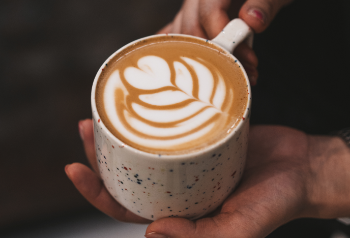
The essence of the third wave is that the preparation of this drink turns into a full-fledged form of art. Only the choicest varieties of grains are used. Baristas disseminate the coffee culture in a spellbinding way.
As a logical continuation of this philosophy, we’ve built a brand strategy aimed at further humanization of the service.
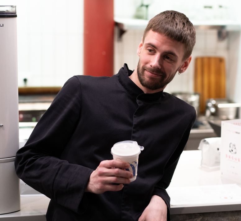
Previously, baristas used to provide clients with high-quality coffee and information about it. Now, they also engage customers in heart-to-heart conversations. After talking to them, you’ll get such a pleasant feeling as if you visited the coffee kitchen of a close friend. They can recommend an aspiring stand-up comedian to you, share the news about the GTA VI development or put on a rare vinyl edition of Eric Satie and share your sadness on a rainy day.
This concept laid the foundation for the communication basis of our brand. It had an impact on the design of coffee shops. When you visit them, you’ll see: this spot is dedicated to movies, this one is about barber haircuts, and succulents are bred in the third one. It’s always more fun to spend time in such handmade places than in uniformed soulless chain cafes. The atmosphere of our venues subtly conveys the key message of our brand: “Switched on coffee”.
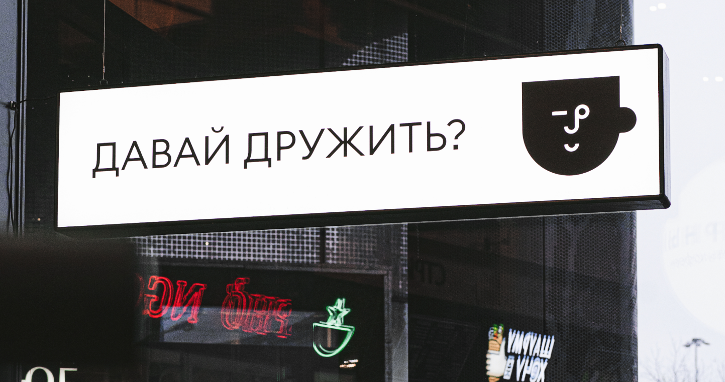
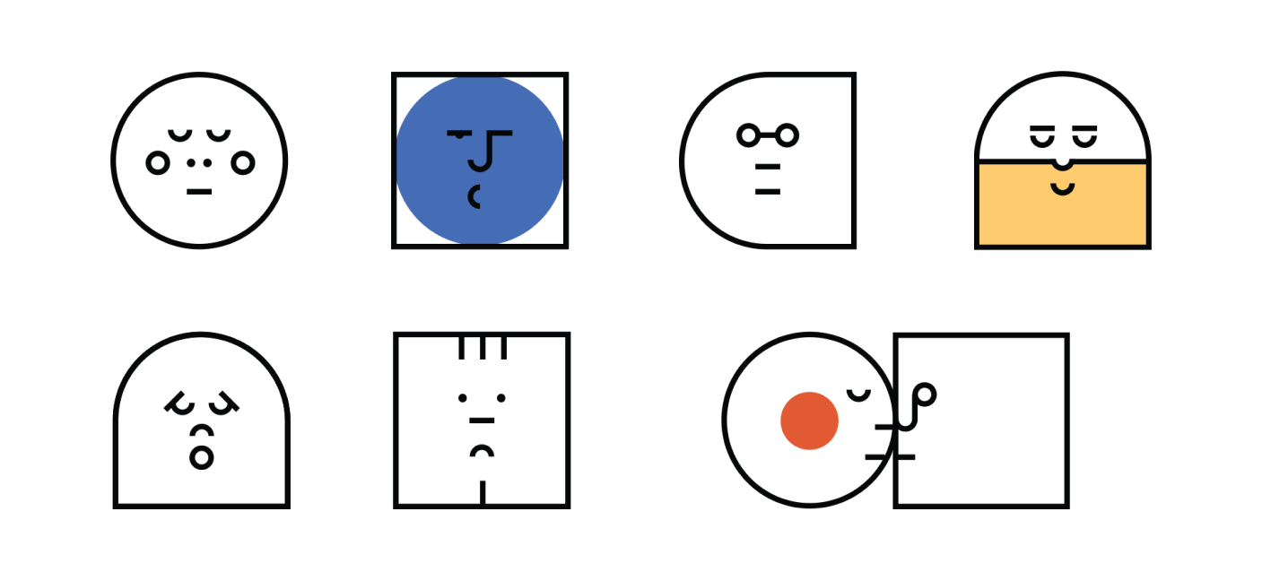
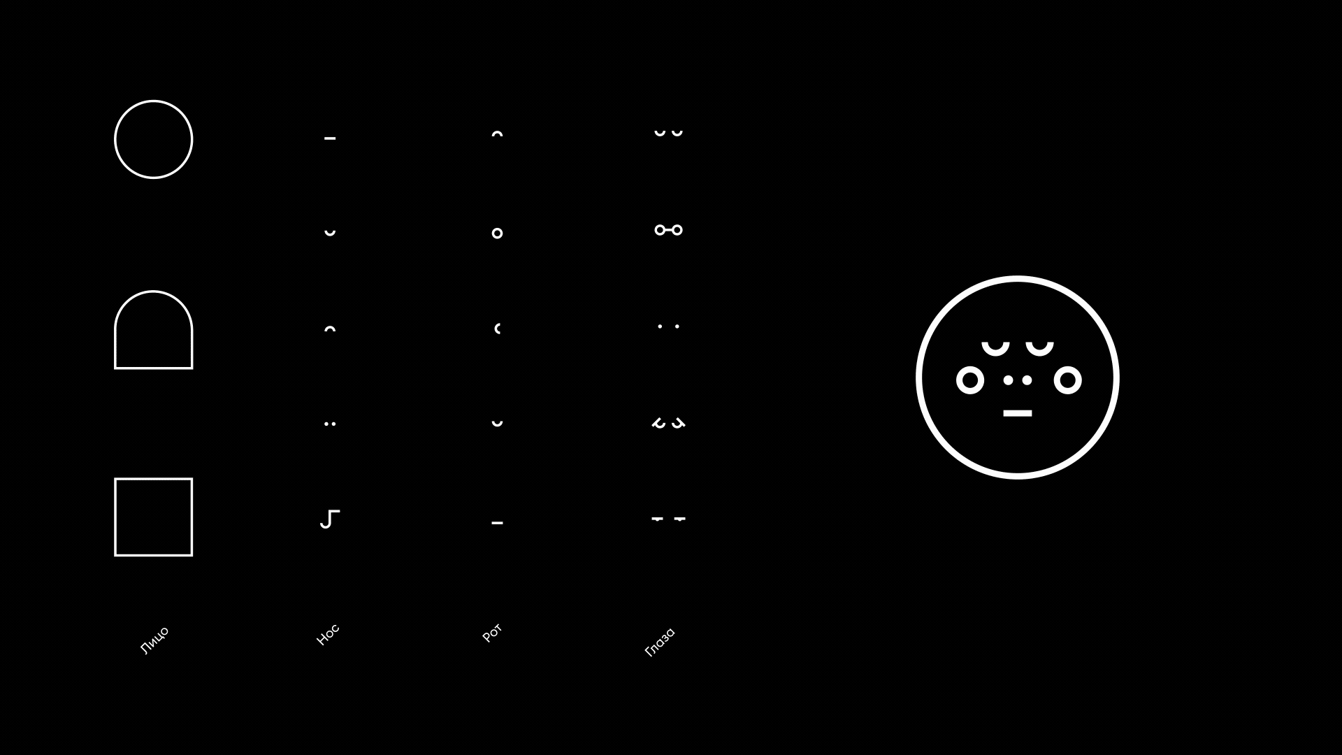
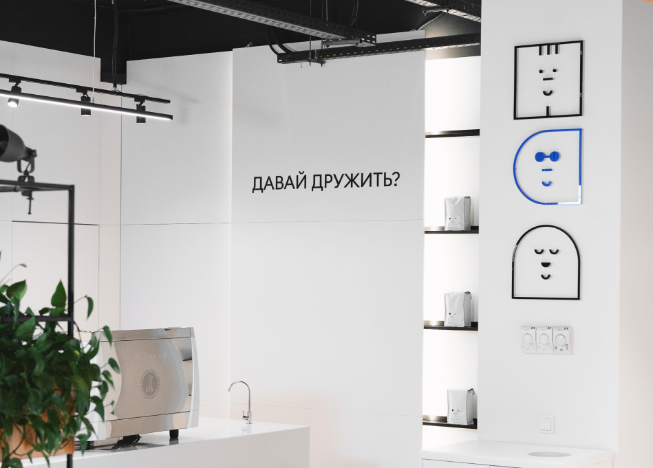
We came up with a very precise visual solution for our logo. It resembles the face of your coffee buddy who winks to you cheerfully from a street sign. The identity options display various emotions that baristas deliver to their clients.


With the help of warm and pastel colors, we made our brand stand out from the traditional specialty coffee shops.


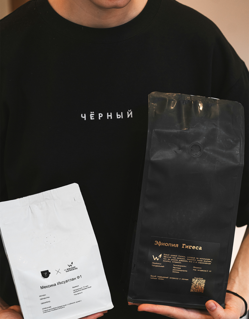
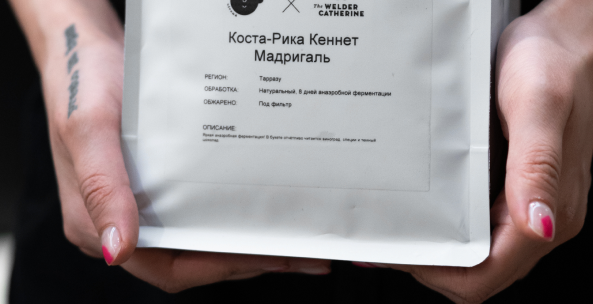
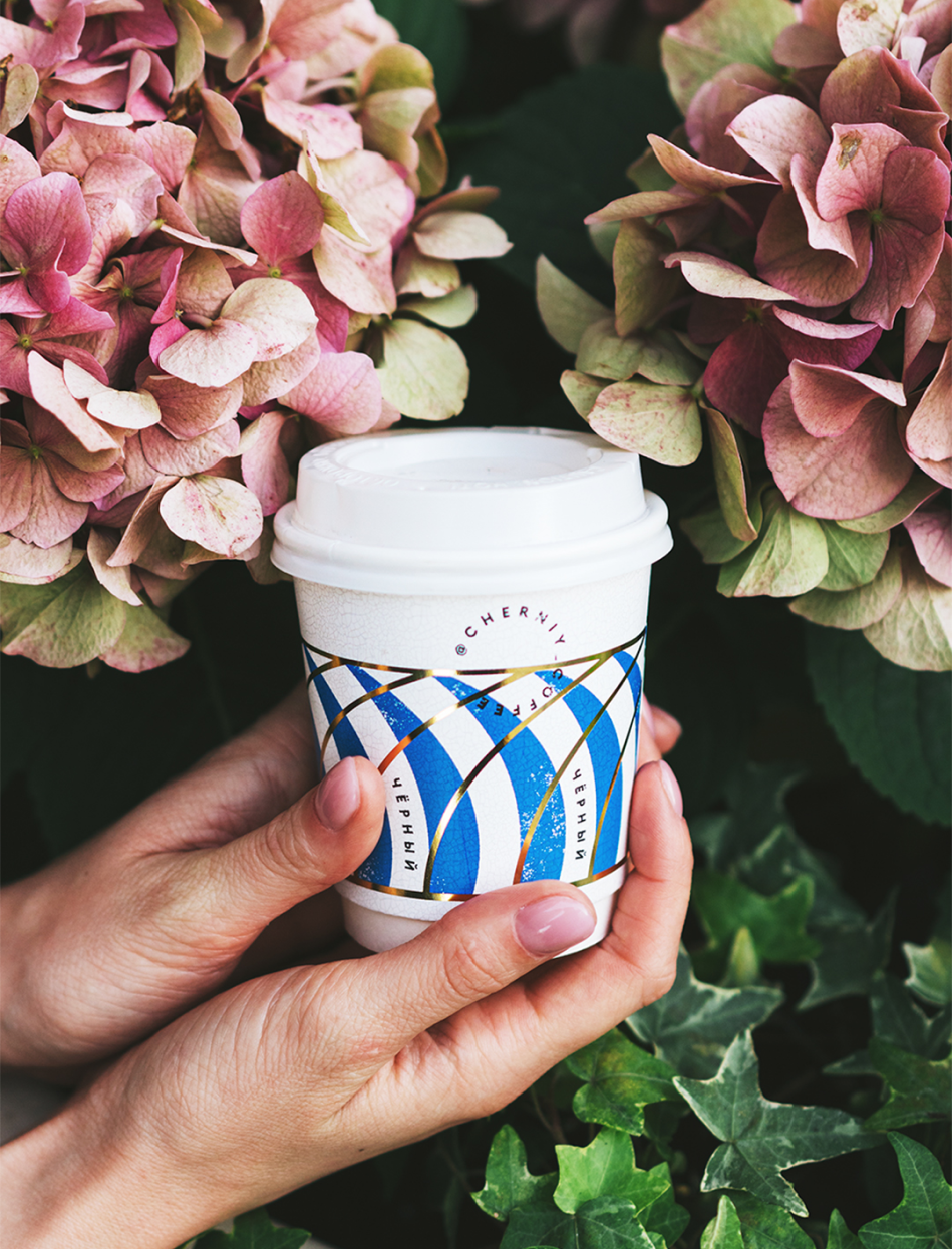
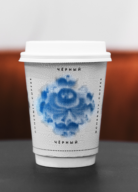
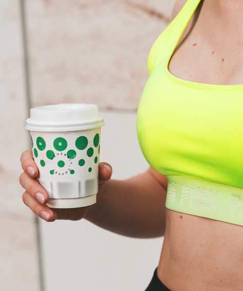
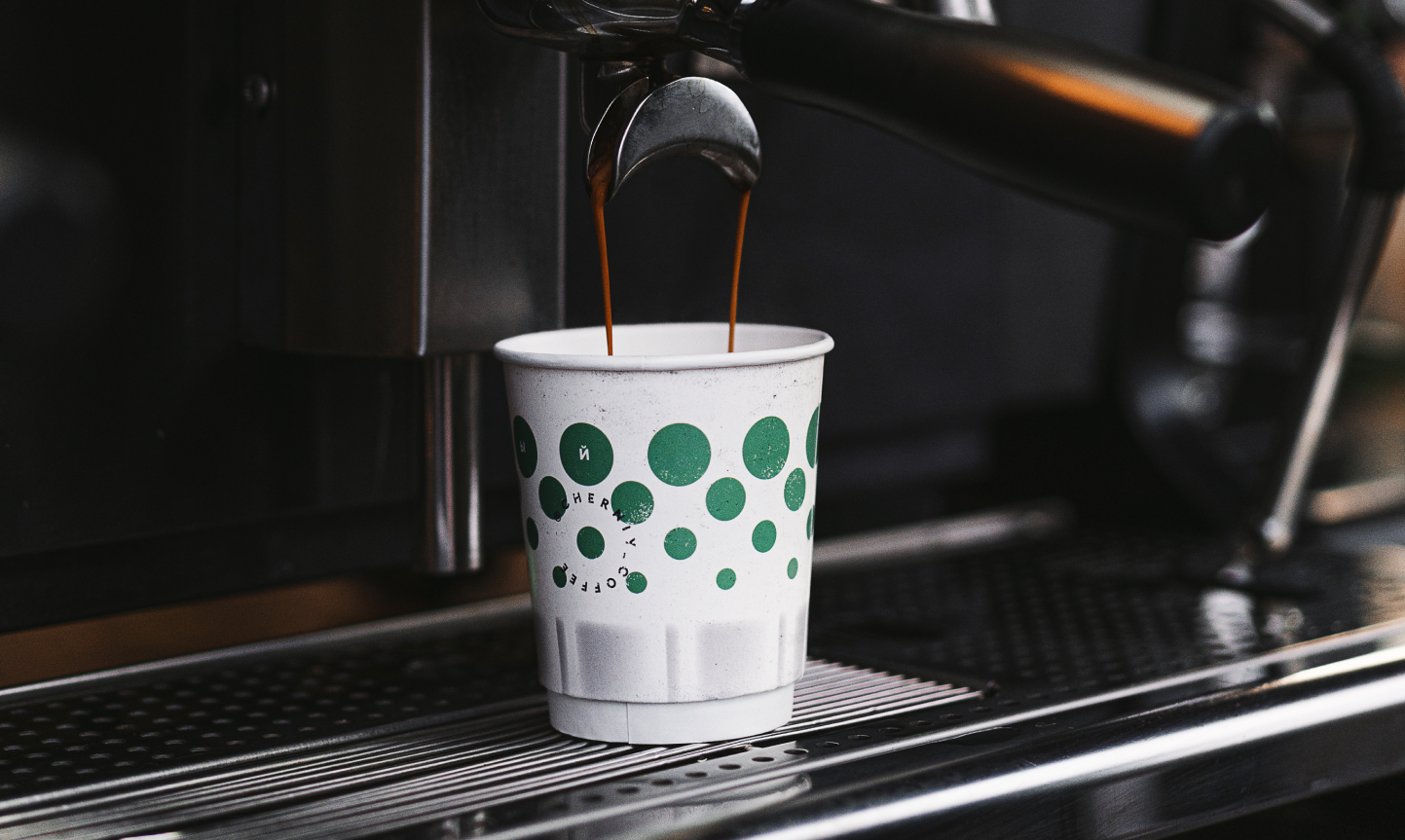
Our first release of paper cups was inspired by worn-out polka dots, Gzhel ceramics and geometric patterns of Soviet dishes that evoke so many cordial emotions among our target audience (including ourselves).
That's how unique locations, new knowledge and interesting friends crop up! We welcome you to our common path — the Groovy path!
Summary
Client
Chain of coffee shops "Black"
Industry
Hospitality
Restaurants
Services
Brand strategy
Naming
Identity
Partners
Robert Dertsyan
Alexey Evdokimov
Team
Lara Gryazeva - strategist
Masha Knopp - designer
Dmitry Muravyov - copyright
Alexey Evdokimov, Robert Dertsyan - creative
2022
Projects
Agency
Our approach
Contact us
+34 674 440 158
hello@tbtbo.com
Placa del Bonsucces 7,
08001, Barcelona, Spain
© 2022, tbtbo brand mastering